
As Ray says, “The way a text looks significantly impacts how its message is received.” She also says that the visual impact of the page is important so the author and illustrator must think about “how it is laid on the page.”
One last thing I wanted to mention is that fact that Ray tells us that “layout and design is really the same for writers and illustrators—it’s where the two truly intersect.”
Here are the Techniques covered in this chapter:
Technique 40: Designing the Placement of Words and Pictures. Words can be placed anywhere on a page in relation to the illustration.
Thought for my teaching: Reconsider giving children paper and telling them to put the picture at the top and the words at the bottom. Let the children take design ownership of their piece!

Technique 41: Using Word Layout to Convey Meaning. Sometimes the placement of words in relation to the picture matches a specific meaning in a book. In “the Runaway Pumpkin” by Kevin Lewis, Illustrated by D. Schindler he writes the words as if they were tractor lines in the picture.
Technique 42: Using Size and Color to Convey Meaning. The size of color of print can convey meaning. In “The Enormous Potato” Illustrated by Dusan Petriclc, the size of the words show how desperate the characters are getting in their attempt to remove the potato from the ground. Each time they call another character to come and help, the words get larger.


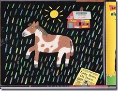
And in Old Black Fly by Jim Aylesworth and Illustrated by Stephen Gammell you can see the use of color to identify the focus letter in this alphabet book.
Technique 43: Designing Print to Convey Meaning. Print may be designed in particular ways for visually meaningful effect.
How about this book, “Look Whooo’s Counting?” by Suse MacDonald? I think the way the numbers are written in the wings fits this technique.

Technique 44: Designing a Cover. Picture book covers are designed in a variety of ways.
Technique 45: Designing End Pages to Convey Meaning. End pages may be designed to enhance the meaning of the book.
Technique 46: Using Borders. Boxes and borders may be used in the design of a picture book.
Technique 47: Using the Space Implied Outside a Picture. Pictures may extend into the invisible spaces beyond the natural borders of the page.
Technique 48: Using Visual Elements in the White Space Around Words and Pictures. Small, meaningful images may be used as visual elements apart from the main illustration.
Technique 49: Using Paper Artifacts as Visual Elements. An illustration may look as if a paper artifact has been dropped or pasted into it from the world outside the picture book.

Technique 50: Using Graphic Features to Show Information. Illustrations may include labels, diagrams, charts, maps, and other visual features designed to show information in particular ways.
Thought for teaching: While teaching kiddos to use these techniques remind children that whatever the technique, less is often better. Don’t let the technique become a distraction to the piece. Encourage children to be purposeful in their use of techniques and to be able to defend their use.
 |


3 comments:
Thanks for hosting! I enjoyed reading your insights and your book selections are great!
Jenny
Owl Things First
I love your book choices! Look Who's Counting looks wonderful. I agree with you. Those little sweeties want to over use the techniques (just like we see exclamation points everywhere)... oh... wait! I do that! Hmmmmm, I wonder where they learn that from.
Thank you for finishing off our book study with a flair!
Thanks for an informative post. I loved this chapter. It's fascinating how text, illustration, and design work together to convey the author's message.
This summer I read through some curriculum manuals trying to refresh my memory on certain elements of programs we use. One of the manuals (I'll leave it nameless) was torture to read. Narrow margins, black text on white page, and just paragraph after paragraph of text. It was amazing how difficult this made it for me to get into the information. While I know manuals aren't picture books, I believe the company did a great disservice to their product by the design choices that were made. Along with being difficult to read, their manual looked unprofessional and dated. It didn't have to be- if they'd only added some shading, boxes, different fonts, something to catch the eye and add interest.
For me, this chapter underlined the complexity of communicating through writing and the necessity of purpose in all decisions. It's the whole package- every component sends a message and many decisions have to be made to make sure it's the message the author truly wants to send.
I have learned so much from this book study. Thank you for hosting our final chapter.
Post a Comment